Poster Design
Hello
I was searching online for some library posters in my area but I didn’t find a specific one that got my attention. I went online and I found two generic ones that I’d like to discuss.
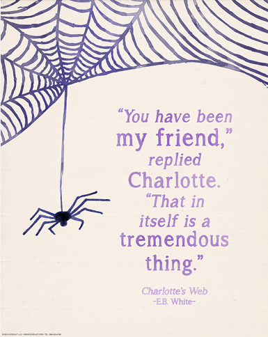
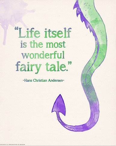
Both posters follow the rule of thirds. It is noticeable that distinctive graphic elements are located in one third while the text occupies the remaining 2 thirds. At least on a horizontal view. The dragon one is more symmetrical in the vertical direction.
The above goes in compliance with the proximity principle as all writing is grouped in one area. Repetition is the third principle we can recognize. The lines of the spider web and the curves of the dragon tail grab viewer attention and create interest.
Contrast is handled with delicacy in the dragon poster. Although all colors are washed out, the greens and purples bring a beautiful soft contrast and help create movement that pushes the eye from the top purple scales on the top right to the pointy tail at the bottom and finally the text. In the spider poster, contrast is stronger but it is the repetition and grouping more than the color what creates the focal attention


Images copyright by Echo Lit ( http://www.echo-lit.com/)
